Từ khóa: barchart; bar chart; barplot; đồ thị cột; đồ thị thanh
Câu 1
Sử dụng dataset bar1.rds
https://github.com/tuhocr/homework/blob/main/dataset/bar1.rds
df_kq <- readRDS("dataset/bar1.rds")
df_kq
   semester gender mean_score sd_score max_score min_score
1       3rd Female   64.77486 13.66542        92        34
2       3rd   Male   71.41736 13.68334        95        32
3       4th Female   65.02993 13.81512        94        30
4       4th   Male   70.55134 13.23573        95        32
5       5th Female   64.60223 14.30171        92        30
6       5th   Male   71.22735 13.73720        97        31
7       6th Female   64.32432 14.26521        94        31
8       6th   Male   71.48963 13.25760        95        36
9      >6th Female   62.83200 13.95831        96        39
10     >6th   Male   71.25843 13.79063        96        34
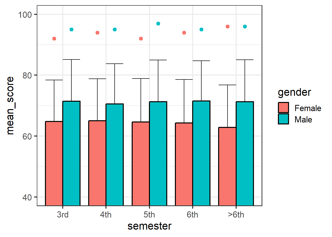
Bạn hãy vẽ đồ thị cột để được hình bên dưới, với các điểm point đại diện cho giá trị maximum của từng nhóm.
Bạn có thể cần lấy factor của cột semester để sắp xếp thứ tự cột cho phù hợp.
df_kq <- readRDS("dataset/bar1.rds")

df_kq$semester <- factor(df_kq$semester,
                         levels = c("3rd",
                                    "4th",
                                    "5th",
                                    "6th",
                                    ">6th"))

library(ggplot2)
ggplot(data = df_kq,
       mapping = aes(x = semester,
                     y = mean_score,
                     fill = gender)) +

  geom_col(position = "dodge",
           width = 0.8,
           color = "black") +

  # geom_boxplot() +

  geom_point(data = df_kq,
             mapping = aes(x = semester,
                           y = max_score,
                           color = gender,
                           fill = gender,
                           group = gender),
             position = position_dodge(width = 0.8)) +

  # nếu dùng scale_y để set limit thì sẽ không được
  # scale_y_continuous(limits = c(50,100)) +

  geom_errorbar(mapping = aes(ymin = mean_score,
                              ymax = mean_score + sd_score),
                width = 0.8,
                colour = "black",
                position = "dodge",
                alpha = 1,
                linewidth = 0.5) +

  theme_bw(base_size = 16) +

  coord_cartesian(ylim = c(40,100))